
How to Design KPI Reports & Dashboards that Turn Data Into Decisions
Most KPI reports generate discussion but not decisions. This guide covers what good KPI reporting looks like — from chart design to signal interpretation to the three questions every performance report should answer.

Most organisations have KPI reports — but very few have KPI reports that change what people do.
Data gets presented. Discussions happen. Reports get filed. And the following month, the same numbers appear, the same concerns are raised, and the same decisions don’t get made. Despite all the effort and technology invested in building these KPI reports and dashboards, performance isn’t improving.
The reason is almost never the technology. The real reason is the design. Most KPI reporting is built to display data — to demonstrate that measurement is happening, to satisfy governance requirements, to fill a dashboard with colour. That is a fundamentally different objective from what KPI reporting is actually for: making it easy to see which performance results need attention, understand why, and decide what to do about it.
This KPI Fundamentals Guide covers what good KPI reporting looks like — the principles behind it, the practices that make it work, and the specific approaches PuMP uses to turn data into performance-improving decisions rather than wheel-spinning discussion.
The important concepts in this guide:
- The purpose of a KPI report — and why most miss it
- A KPI report is only as good as the KPIs in it
- Why the chart type matters — and what actually works
- How to interpret what your KPI is telling you
- How to structure a KPI report so people actually use it
- Where to start — a practical approach to KPI reporting
The purpose of a KPI report — and why most miss it
Before choosing a tool, building a dashboard, or deciding how many charts to include, it’s worth being precise about what a KPI report is supposed to accomplish.
A useful KPI report answers three questions — and answers them in order:
- What is performance doing? Is it improving, declining, stable, or unpredictable? Is there a signal worth responding to, or is this normal variation?
- Why is it doing that? What does the evidence suggest about the causes behind the signal?
- How should we respond? Given what we know about the cause, what are the realistic options, and what are the trade-offs?
In PuMP, these three questions form the backbone of Step 7: Designing Performance Reports. A report that answers only the first question — which describes most KPI reports in use today — is not a performance report. It’s a status display. At best, it tells you what happened, but gives you nothing to confidently act on.
The practical implication is important: report design starts with the decisions your audience needs to make, not with the data you have available. Who will read this report? What decisions are they responsible for? What would they need to see to make those decisions confidently? It’s the answers to those questions that determine the structure, the level of detail, and the chart types — not the capabilities of the software.
FUNDAMENTAL CONCEPT:
A KPI report serves one purpose: to make it easy to see which performance results need attention, understand the cause, and decide how to respond. Any report that doesn’t support all three of those steps is wasting precious time and attention.
Further reading:
A KPI report is only as good as the KPIs in it
Before any of the reporting design work begins, there is a prior question that determines whether the effort is worthwhile: are the right KPIs being reported?
PuMP Partner Louise Watson (now retired) put it directly:
“The demand for a dashboard drives immediate action, but it doesn’t drive clarity of what the leader wanted to change or achieve… Demanding a dashboard decreases any chance that the team would pause and discover that useful and useable performance reports first need great measures, and great measures don’t just happen.”
This is one of the most common failure modes in KPI reporting. Organisations invest in reporting tools, dashboard software, and data infrastructure — and then populate them with whatever data is available rather than what would actually provide evidence of performance. Activity counts, compliance tallies, and project milestones get reported as KPIs because they’re easy to collect. The reports look complete. But they can’t answer the three questions that matter, because they aren’t measuring results.
A KPI report built on the wrong KPIs will consistently produce discussion without decisions — because the data being discussed isn’t connected to the performance results people are actually trying to improve.
If there is any doubt about whether the KPIs being reported are the right ones, that is the place to start — absolutely before investing in report design or dashboard technology. Guide 1: What is a KPI? covers what makes a KPI meaningful, and Guide 2: How to Design Good KPIs covers the structured process for getting there.
FUNDAMENTAL CONCEPT:
Good KPI reporting starts with good KPIs. Reporting activity measures beautifully is still reporting the wrong things.
Further reading:
Why the chart type matters — and what actually works
Most KPI reports use the wrong charts. Not because the people who built them didn’t care, but because the charts that look most impressive in dashboards — dials, gauges, traffic lights, pie charts, single-period bar charts — are the least useful for understanding performance.
Here’s why: performance is not a snapshot. It is a pattern that unfolds over time. A single data point tells you a value. A sequence of data points over time tells you whether things are getting better, getting worse, staying stable, or behaving unpredictably. You cannot manage performance from a snapshot, any more than you could navigate a journey by looking at a photograph of where you were last month.
The minimum standard: a time-series chart
At the very least, KPIs should be displayed as time-series charts — line charts that show values across consecutive reporting periods. This alone is an improvement over the majority of dashboards in use today, because it restores the temporal context that snapshot charts ignore.
But a line chart still leaves a critical gap: it shows you what the values are, but gives you no truly reliable way to tell whether a movement represents a real change in performance or simply the normal variation that every measure contains. Without that distinction, every dip triggers alarm and every rise triggers celebration — and most of the time, neither are warranted.
The XmR chart: the right tool for KPI reporting
The solution to this gap has existed for over a century in the field of statistical process control, and was brought to management by Donald Wheeler in his foundational work on understanding variation. Wheeler’s central insight — that no data has meaning apart from its context, and that the task of analysis is to filter noise so that real signals can be seen — underpins everything that follows.
The chart that applies this insight to KPI reporting is the XmR chart. Built on Wheeler’s process behaviour chart methodology, it adds two pieces of information to a standard time-series:
- A central line representing the current baseline level of performance — what the process is actually delivering on average
- Natural Process Limits — the upper and lower boundaries of normal variation, calculated from the data itself
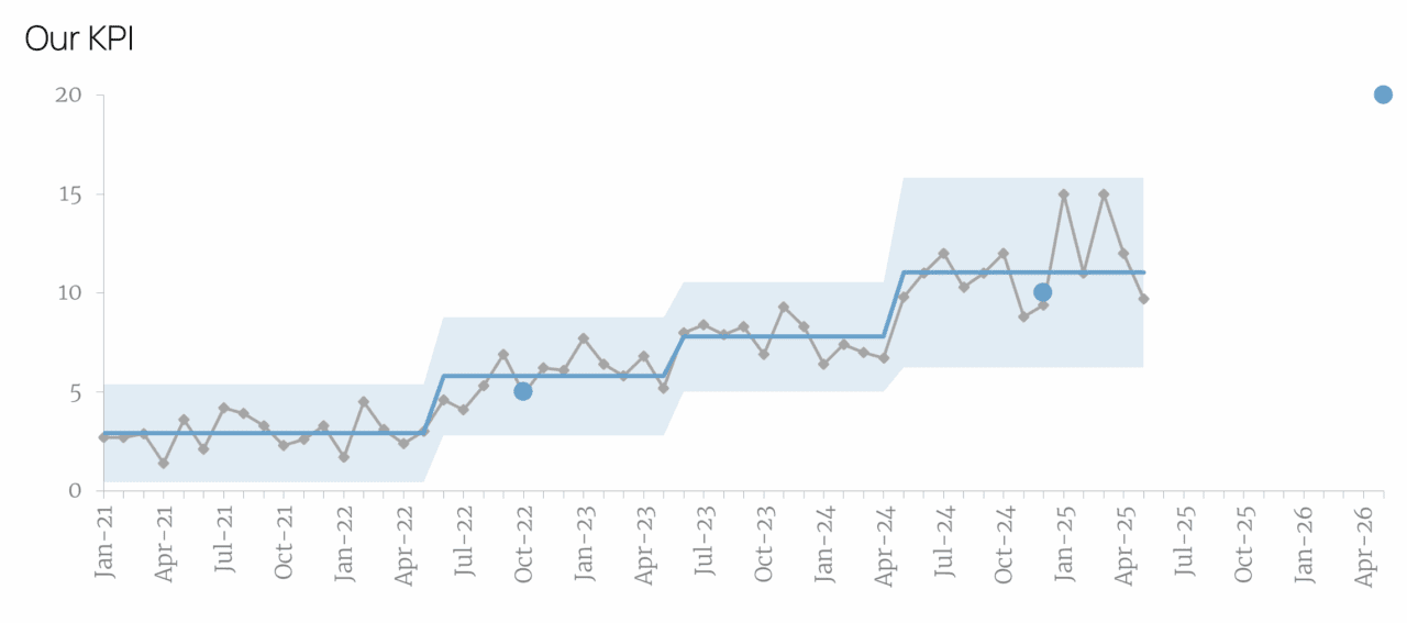
Together, these elements give you a principled, statistically grounded way to answer the first of the three reporting questions: What is performance doing? Rather than any single point’s behaviour, it is a sustained run of points on one side of the central line that signals something has really changed and warrants investigation. Everything else within the limits is noise — normal variation that doesn’t require a response.
This distinction matters enormously in practice. Organisations that report KPIs without it spend significant time and energy reacting to noise: investigating dips that are within normal variation, celebrating rises that will naturally correct themselves, and initiating improvement projects to fix problems that don’t exist. Wheeler called these Error 1 and Error 2 respectively — acting when you shouldn’t, and failing to act when you should. Both are costly. The XmR chart largely eliminates both.
The PuMP approach to XmR chart design
In PuMP, the XmR chart has been refined specifically for KPI reporting in organisational settings — a context where charts need to communicate clearly to leaders and practitioners who are not statisticians (or even not fully comfortable with numbers).
The current design — XmR 3.0 — was developed in collaboration with practical data visualisation expert Nick Desbarats, building on earlier work with Stephen Few, whose principles of visual data communication shape the entire approach. The design makes three things visible at a glance:
- Whether performance is changing (the signal)
- The size of that change (the shift in the central line)
- How far current performance sits from its target (a single point to the right of the chart)
One chart. Three answers.
For a detailed look at the visual improvements of XmR 3.0, see One Chart That Tells Your KPI’s Complete Story. For a practical guide to building one, see How to Build an XmR Chart for Your KPI.
What to avoid
The charts most commonly found in KPI dashboards — and least suited to performance reporting:
- Dials and gauges show a single current value with no history. They tell you where you are, not whether anything has changed or which direction you’re heading.
- Traffic lights create binary thinking (green = fine, red = act) that ignores the distinction between signal and noise. A KPI in the red zone that’s moving toward the target doesn’t need fixing. A KPI in the green zone but trending in the wrong direction does.
- Pie charts show composition, not change over time. This can be useful for performance diagnosis, but they have almost no useful application in KPI reporting.
- Bar charts and line charts that stack KPIs year-on-year make the right comparisons difficult and unreliable. They amplify the very noise the XmR chart is designed to filter out.
FUNDAMENTAL CONCEPT:
The right chart for KPI reporting shows change over time with enough historical context to distinguish a real signal from normal variation. The XmR chart — grounded in Donald Wheeler’s work on understanding variation and refined through collaboration with Stephen Few and Nick Desbarats — is the standard PuMP uses.
Further reading:
How to interpret what your KPI is telling you
A well-designed chart reveals the signals. Interpreting them correctly — and responding proportionately — is a separate skill, and one that significantly affects whether KPI reporting drives improvement or creates noise of its own.
The starting point is Wheeler’s two errors, which are worth keeping visible:
- Error 1: Treating noise as a signal — reacting to normal variation as though it represents a genuine change. This produces a constant cycle of reactive fixes, investigations, and explanations that exhaust resources without improving performance.
- Error 2: Treating a signal as noise — failing to respond to a genuine change because it doesn’t look dramatic enough, or because the organisation has habituated to variation in the measure. This allows real problems to persist and real improvements to go unreinforced.
Most organisations, in the absence of XmR charts, make both errors simultaneously — reacting enthusiastically to the wrong things while missing the patterns that would lead to confidently choosing the right responses.
The three basic signal types
An XmR chart surfaces signals through very specific patterns. There are almost a dozen of these, but the three most commonly seen in our KPIs are:
- A point outside the natural process limits — something unusual happened in that period. The first question is whether it was a data anomaly or a real event. If real, the cause is likely specific and identifiable — a one-time factor, an external event, a process change. Just investigate to find out why — but likely no other action is needed.
- A small but real shift — a sustained run of eight or more consecutive points on the same side of the central line indicates that the underlying baseline of performance has changed. This is a signal worth investigating for causes, because it reflects a systemic change rather than a one-off event.
- A large shift — three out of four consecutive points closer to a natural process limit than the central line suggests that something sudden has had a bigger impact on performance. Like the small shift, this warrants cause investigation.
Each signal type calls for a different kind of response. A point outside the limits calls for investigation of a specific event. A shift calls for analysis of what changed in the system or process that drives the measure.
A word on KPI thresholds
Many organisations report KPIs against fixed thresholds — a traffic light turns red when the value falls outside a set level or range. The intention is reasonable: focus attention on the measures that need it. The problem is that thresholds don’t account for variation. A KPI that fluctuates between 62% and 71% under normal conditions will regularly cross a 65% threshold without anything having actually changed — generating false alarms and the reactive behaviour that follows. Thresholds have a role in absolute compliance monitoring, but they are a poor substitute for the signal detection that an XmR chart provides. There are ways to use XmR charts in combination with thresholds, but this is covered in more depth in formal XmR training.
FUNDAMENTAL CONCEPT:
Not every movement in a KPI is a signal worth responding to. The XmR chart’s natural process limits give you a principled basis for knowing which movements are — and which are simply the normal variation of a stable process.
Further reading:
How to structure a KPI report so people actually use it
Individual charts communicate individual KPIs. A well-structured report communicates the story of organisational performance — connecting each KPI to the goal it provides evidence of, surfacing the signals that need attention, and giving the audience what they need to act.

Cluster KPIs under their goals
The most important structural principle in PuMP’s Report Design technique is to organise KPIs under the goals they are designed to measure, not by organisational unit, data source, or functional area. This keeps the connection between evidence and strategic intent visible at a glance — which is the point. If a leader has to reconstruct that connection themselves every time they read the report, the report is making their job harder rather than easier.
In practice this means the report has a section for each priority goal or strategic result, containing the two or three KPIs that were designed as the best evidence of that result. Each KPI appears as an XmR chart with its signal status clearly visible.
The three-question narrative for each KPI
For each KPI that carries a signal — particularly a shift, trend, or point outside the limits — the report should include a brief narrative structured around the three questions:
- What: State the signal clearly. What has changed, by how much, and in which direction?
- Why: Summarise what the evidence suggests about the cause. Not speculation — what does the data and process analysis actually indicate?
- How: Offer two or three realistic response options with their trade-offs, so the audience can make an informed decision rather than defaulting to the first solution suggested.
This three-part structure — which PuMP applies consistently in its Report Design technique — is what turns a report from a display of data into a brief for decision-making. It is the difference between a report someone reads carefully and one someone scans before moving on.
For KPIs showing no signal — stable performance within the natural process limits — the report needs only to confirm that status. The same goes for KPIs that have already reached their targets. No narrative is required. This discipline also reduces report length considerably.
Build trust in the data alongside the results
One reason KPI reports frequently generate debate rather than decisions is that people don’t trust the numbers. They question the methodology, the data source, or the calculation — and the conversation shifts from performance to measurement validity.
PuMP Step 5 addresses this directly by documenting the definition, data source, calculation method, known limitations, and assumptions for each measure — and making that documentation accessible alongside the report. When the audience can see how a measure was constructed, disputes about the data are resolved before they derail the performance conversation.
FUNDAMENTAL CONCEPT:
A well-structured KPI report clusters measures under their goals, surfaces signals clearly, and provides a three-question narrative — what the signal is, why it is likely occurring, and how the organisation might respond — for each KPI that warrants attention.
Further reading:
Where to start — a practical approach to KPI reporting
Good KPI reporting doesn’t require a full organisational rollout to be useful. The most effective way to start is narrow and iterative:
- Choose one priority goal.
- Confirm that it is expressed as a measurable result, not an action or a vague aspiration.
- Identify the two or three KPIs that were designed as the best evidence of that result.
- Build an XmR chart for each one.
- Structure the output using the three-question format.
- Show it to the people who are responsible for that goal.
That is a meaningful KPI report — even if it’s one page, built in Excel, covering a single goal. It can be done in a week. And once you’ve seen what a signal actually looks like in a well-constructed chart, and experienced a performance conversation that reaches a decision rather than circling back to the data, the case for extending the approach to the rest of the organisation makes itself.
From that starting point, add goals and their KPIs incrementally — not all at once. The discipline of keeping each goal’s KPIs to the two or three best evidential measures is as important as anything else in the design. A report covering fifteen goals with two KPIs each is manageable. A report covering five goals with twelve KPIs each is not.
For hands-on skills in building XmR charts — including how to construct them in Excel, how to display them in dashboards, and how to use them to guide improvement — Using Smart Charts is the practical program that covers all of this in depth.
FUNDAMENTAL CONCEPT:
Start with one goal, two or three well-designed KPIs, and one XmR chart each. Get the structure right at small scale before expanding. Good KPI reporting is built by iteration, not installation.
Further reading:
Ready to go further?
If this guide has clarified what good KPI reporting looks like, the natural next question is whether your current KPIs would actually give you something worth reporting. Guide 2: How to Design Good KPIs covers that in full.
For the practical skills to build XmR charts, display them in dashboards, and use them to close performance gaps, Using Smart Charts is where to start.
Or if you’d like to work through the full PuMP methodology — from designing meaningful KPIs to reporting them and using them to drive improvement — PuMP Blueprint covers every step.