There are three anatomical features that make the PuMP Results Map the most powerful way to visualise, communicate and align a measurable strategic direction throughout your organisation.

The Results Map is the best foundation to align the entire organisation to a single strategic direction, meaningfully, logically, and systemically. And that’s because, despite its simple anatomy, it carries the vital information everyone needs to focus on how they contribute to achieving the strategic direction.
And when performance measures are chosen to align with the Results Map, they will collectively tell the story of how the whole is performing: the whole organisation, the whole department, the whole team, the whole process.
PuMP’s Results Map achieves this with three simple pieces of its anatomy:
- Layers, which guide how a strategic direction is aligned (or cascaded) throughout the organisation
- Result bubbles, which focus everyone on the measurable performance results they contribute to achieving the strategic direction
- Connectors, which link all the results (and their owners) together into a single story of strategy for the organisation
Here’s how they achieve this…
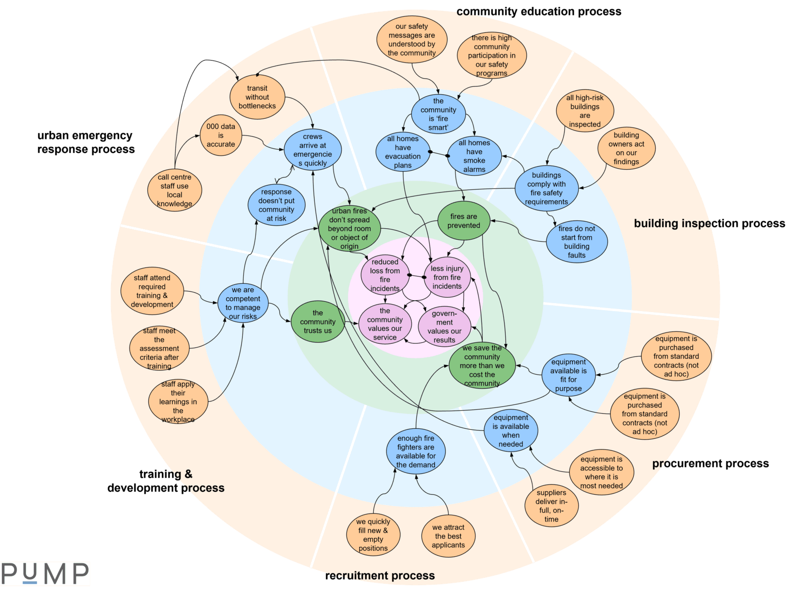
Layers in the Results Map make alignment clear and logical.
A Results Map has four layers, denoted by colours. In the Results Map for the Fire Department above, we can see an orange layer around the outside, then, moving toward the middle, a blue layer, a green layer, and finally a pink layer in the centre.
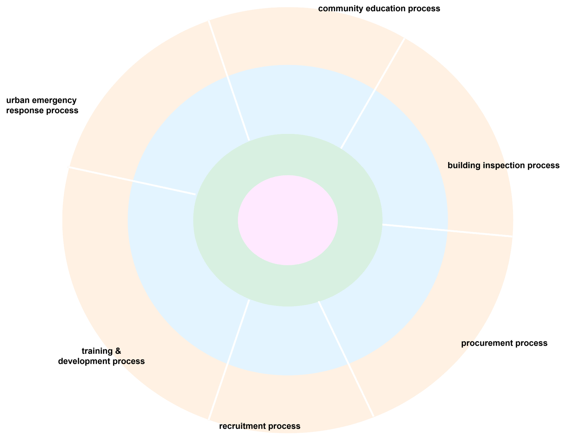
Each of these layers contains a specific category of results:
- The pink layer contains the performance results implied by the mission and vision, or the purpose, of the organisation. These are the ultimate results that the organisation or business intends to achieve, and they usually change very slowly, if at all, over time. These results typically have a 10- or 20-year time frame, or even longer.
- The green layer contains the performance results implied by the current strategic goals for the organisation or business, as a whole. These goals describe the priorities to improve overall for the organisation so it can better fulfill its mission and move closer to its vision. These goals typically have a two- to five-year time frame. They will change as the organisation grows its capability and new improvement priorities emerge.
- The blue layer contains the priority performance results for business processes, such as the maintenance process, the customer delivery process, the marketing process, or a procurement process. If an organisation is not process-oriented, then the blue layer will contain the priority performance results for the organisation’s main functions, like human resources, operations, or marketing. Either way, the blue performance results focus on what needs to improve for the organisation to achieve the green results. Results in the blue layer typically have a one- to two-year time frame.
- The orange layer contains the priority performance results that are specific to parts of business processes or business units within the main functions of the organisation. These performance results focus on what needs to improve at a specific operational level in order to achieve the blue results. Results in the orange layer typically have a time frame of a few months to a year or so.
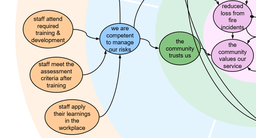
Result bubbles in the Results Map focus on priority performance results.
The result bubbles are colour-matched to, and positioned within, each of the four layers of a Results Map. Each bubble contains a specific performance result. These performance results describe the intent of each goal in the organisation, in result-oriented and measurable language.
Goals are often written vaguely (with weasel words) which makes them too difficult to understood or to be measured. So their true intent is derived from the PuMP Measurability Tests technique (an introduction is here). And the product is performance results, that say more clearly what our goals really mean.
Rewriting our goals so they say more clearly what they really mean not only makes them more easily and meaningfully measurable, but also makes them easier for everyone to understand and align to.
Connectors in the Results Map make the story of strategy visible.
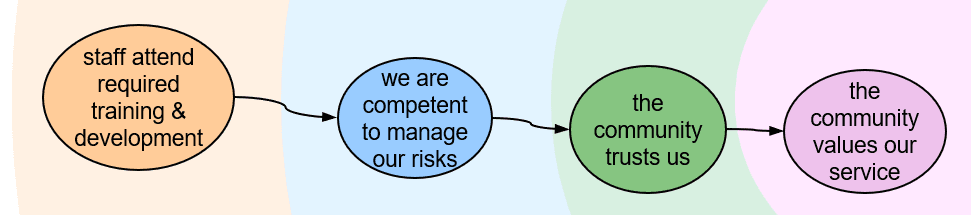
The connectors in a Results Map give everyone a clear line of sight from the performance results they own, through to their ultimate impact on the strategic direction and purpose of the organisation.
There are different connectors to describe the different relationship types that can exist between performance results:
- The cause-effect relationship is depicted by a line with an arrow, starting at the cause and pointing to the effect. In the fire department’s Results Map, the green result of “fires are prevented” has a cause-effect relationship to the pink result of “less injury from fire incidents”.
- The companion relationship is depicted by a line with a solid dot on both ends that I like to think of as holding the two results together. There is a companion relationship between “enough fire fighters are available for the demand” and “equipment is available when needed” in the fire department’s Results Map.
- The conflict relationship is depicted by a line with an arrow on both ends, but a different style of arrow from that used for the cause-effect arrows. In the fire department’s Results Map there is a conflict relationship between “crews arrive at emergencies quickly” and “response doesn’t put the community at risk”.
The Results Map is uniquely powerful in communicating the story of strategy.
Balanced Scorecard Strategy Mapping doesn’t put enough emphasis on writing goals (strategic objectives, in its language) that are measurable. It forces goals into relationships that don’t feel natural to everyone (its four perspectives). And it doesn’t make it easy to see a clear line of sight from operational teams’ goals to the strategic goals (its tiers are separated and unconnected).
Logic models don’t always emphasise measurable goal writing, either. And while they map logical relationships between goals, they are often focused only on the linear logic for a single program or outcome. The link to strategy is not always clear, either.
Even though its anatomy is quite simple, the PuMP Results Map can at first appear quite complex to look at. But the overwhelming majority of people understand it in less than a minute. And suddently, for the first time, they see how they fit within and contribute to the purpose of the organisation. This clarity creates ownership and engagement like you’ve never seen before.
Building a Results Map requires some skill, especially in translating a action-oriented or vaguely worded strategy into measurable performance results. If you’re keen to learn more, just ask us!